Personalized Onboarding Experience Transforms Family Finances
By personalizing the onboarding experience for a seed stage fintech’s mobile app, I increased conversion by 70% over 12 months, connecting more families with a financial assistant and essential financial products.
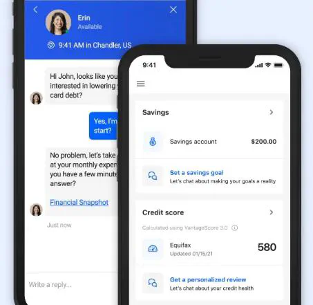 Chat and mobile UI. Image credit: Brightside via Obvious Ventures
By rapidly working to define the onboarding funnel, analyzing the conversion rates of various cohorts & segments, and applying that knowledge to a personalized onboarding experience, I was able to drive a 70% improvement in onboarding conversion in less than 12 months. These types of high double digit changes in conversion are often possible only on emergent products, as was the case at this seed stage company.
Platform
Brightside offers a unique platform for financial health, connecting employees (clients) from an employer’s company (customer) with fee-free checking and savings accounts, personalized service from an in-house financial assistant available via call or chat, payroll-linked lending solutions, and much more.
Most of these services were intended to be offered after a personalized financial assessment with one of its financial assistants, and therefore connecting a client with these financial assistants was one of the primary objectives of the onboarding experience.
Evidence for Personalization
In the original onboarding experience, clients already completed a simple survey which provided basic context about their financial picture. However, this information was not used to reflect, suggest, or guide users to their first step.
When this survey data was analyzed in context with the funnel, it provided key insights on (1) who was most likely to connect with our financial assistants, (2) when they did so, and (3) how often. These insights helped our team brainstorm the most impactful financial topics and next actions to surface for a client at the end of the onboarding experience to maximize the likelihood of an outreach attempt to our financial assistants.
Evident from the early data was an observation that many of our highest-intent clients—those connecting with the product because of an acute financial need—were those most likely to connect with a financial assistant. While others, we hypothesized, were more likely to become “surprised” by the manner in which our onboarding experienced suddenly terminated with a pop-up chat message. After the surprise, they also tended to get “lost” in our experience default home page experience which offered very few self-service opportunities.
These hypotheses were supported by the engagement data—high intent users (as defined by their stated needs) were more likely to engage, but to do so later, and lower intent users (with less urgent money needs) engaged at a much lower rate and were much more likely to churn before doing so.
As a result, optimizing the onboarding experience required a thoughtful application of these insights—to maintain the efficiency of our onboarding experience for those with an urgent need while increasing the relevance of our offerings to those with lower intent. Since our platform’s unique offering of a real financial assistant is both its super power and a required pre-requisite for provision of critical products, educating clients about how the role of a financial assistant and how they could help was important for both populations.
Personalizing the Experience
Ultimately, we tested a increasingly personalized set of experiences, guided both by the client’s responses to our financial health survey and a “fork” of user choices in the flow to enable clients to choose which action they’d like to pursue at the conclusion of onboarding. The changes had the following objectives:
- Convince the client we had relevant products and services matched to their needs
- Explain the role of our financial assistants
- Invite the client to start the conversation with their financial assistant OR explore another option
By increasing the saliency of our offerings and fully contextualizing how we help (via our financial assistants), the changes drove a 70% improvement in onboarding conversion in less than 12 months. For high intent clients, engagement increased while the time to engage was reduced. Lower intent clients saw similar results, choosing to reach out to our financial assistants and also opening our savings accounts (self-service) at higher rates.
A note on experimentation: At companies later in their growth cycle, there’s often sufficient volume across onboarding flows to run experiments that allow for confidence about statistical significance about changes in conversion. However, because of the company’s product maturity at the seed stage and the monthly cycle of new employee traunches as a B2B2C product, we did not have the luxury of guaranteeing statistical significance. However, I was able to use time-boxed A/B test windows around these cycles to confirm that successive rollouts on the way to this fully personalized experience were indeed accretive to engagement.
Tools and Analysis
Joining a company at the seed stage comes with many opportunities and challenges. There’s a tremendous opportunity to make an impact, but you often have to build, from scratch, a lot of the tooling necessary to identify the greatest opportunities for impact.
Although small and scrappy, Brightside had a native mobile application on both Android and iOS with a consolidated event stream in Firebase (before it became Google Analytics for Mobile). Given my experience writing software and SQL queries, I was able to performing a bespoke graph network analysis of the respective funnels on each app to discover the event names corresponding to user actions, to map these events to high-level funnel steps, and ultimately to calculate conversion rates at each step. It’s worth noting that this process also helped to identify a number of bugs–some across both apps, others specific to one platform–that were silently hurting conversion and explained hard-to-investigate feedback our team had received.
Underpinning this analysis was a set of custom SQL queries that mined our BigQuery database of events and computed pairwise event transitions (e.g. event1 -> event2 | 2 users), Ruby scripts that processed and normalized this information to generate GraphViz visualizations of the user behavior as a connected graph, and exported spreadsheets used as pivot tables to understand conversion breakdowns based on survey results and engagement data from our Salesforce instance. There was undoubtedly a lot of manual work as part of this analysis process, but it was ultimately possible to turn parts of the analysis into repetable artifacts that informed product decisions, such as a live dashboard of the funnel performance driven by the BigQuery data from Firebase.